How Maps Work

By: Tracy V. Wilson & Alia Hoyt  | 
This political map of the world shows the borders of each country and its chief city or cities. kosmozoo/Getty Images

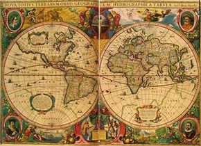
It's easy to think of maps as sets of visual directions. Whether you're trying to get to the top of Mount Everest or to a friend's new home, a map can help you find your way. But maps can do more than help you figure out where you are and where you're going. They are representations of information that can describe nearly anything about the world.

If you wanted to get an idea of which dog breeds are most popular in different regions, you might spend days looking at lists and charts. Or you could look at a map and get an instant grasp of the same information. Learning about the physical features, imports, exports and population densities of different countries would take ages if you relied on written descriptions in a book. But with a map, all of the numbers, patterns and correlations are right in front of you. As Ian Turner, senior cartographer at GeoNova, put it, "A map is a type of language. It's a graphic language. It presents information in hopefully a way that is very easy to understand."

Advertisement

It's the job of a cartographer (someone who makes maps) to put all of this information into a format that people can understand and learn from. Exactly what a person can learn depends on the type of map. Most maps start with an outline of a location, like a piece of land or a body of water. Then, they provide information about the location's attributes. Different maps incorporate different attributes. For example:

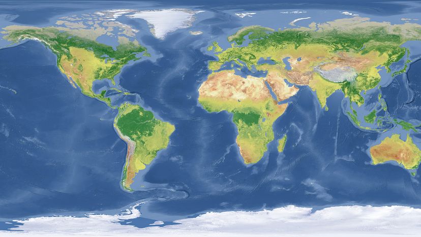
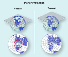
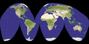
  • Physical maps illustrate landforms like mountains, deserts and lakes. With a physical map, you can get a basic sense of what all or part of the planet looks like and what its physical features are. Physical maps usually show differences in elevation through hypsometric tints, or variations in color. Topographic maps, on the other hand, illustrate the land's shape and elevation using contour lines.
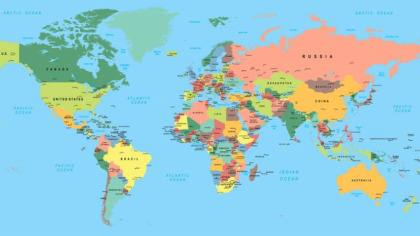
  • Political maps display cultural information about countries, their borders and their major cities. Most political maps also include some physical features, like oceans, rivers and large lakes.
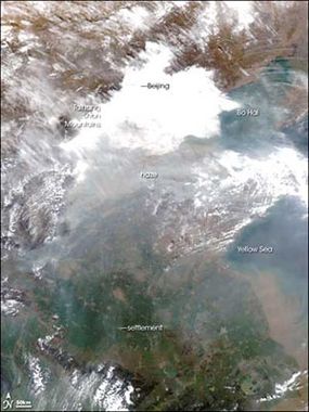
  • Thematic maps add information on a specific theme, or subject. Examples of common themes are population density, land use, natural resources, gross domestic product (GDP) and climate. Thematic maps can also show extremely specialized information, such as the availability of internet access in different parts of the world.

This combination of locations and attributes makes it possible to put lots of information into a very small space. A single map can show you all of the countries on a continent, their borders, their approximate populations and their primary imports and exports. People can also use specialized thematic maps to analyze trends and patterns in all kinds of data. A map showing communication costs in different parts of the world, for example, could help a nonprofit organization decide where to build a low-cost wireless network. As Turner explained, "Maps are more than about capitals and countries — it's really about how economics and climate and natural features, how all the different variables that make up a society relate to one another."

Common conventions help cartographers present all this information in a way that makes sense. We'll look at them in more detail in the next section.

Advertisement

Cartography Conventions

This physical map of the world shows its terrain. xingmin07/Getty Images

Even though they can incorporate diverse sets of data, maps usually follow several basic conventions that help people make sense of them right away. Turner explained, "[One convention] used in cartography on political maps, on most maps is that the water is blue. It can throw people when you try to use a different color to signify something like water." In addition, on physical maps, land masses are usually brown or tan, and vegetation is green.

Maps depict their subject matter from above and use lines and color to differentiate between regions. Political maps tend to use similar symbols and type sizes to indicate borders, cities and other objects. On many, but not all, maps, north is at the top — other maps often include an arrow to indicate directions. Most maps have a legend explaining their symbols, and many have a scale noting relationship between the size of the map and the size of the real world, such as 1 inch to 100 miles. Some maps express scale as a ratio, such as 1:25,000.

Advertisement

Most maps also include some kind of coordinate system to help people find specific locations. On a street map of a city, this might be a simple grid marked with letters and numbers. Larger maps usually use imaginary lines known as longitude and latitude. On a globe, these lines are orderly and evenly spaced. All lines of longitude, or meridians, run in a north-south direction are the same length. The lines of latitude, or parallels, all run east and west and are shorter the farther they are from the equator.

Meridians are numbered from 0 to 180 degrees east and west. Parallels run east to west and are numbered from 0 to 90 degrees north and south.
HowStuffWorks

Maps, on the other hand, can wreak havoc on the parallels and meridians. This is because Earth is shaped roughly like a pumpkin and getting a flat piece of paper to accurately resemble the entire surface of a pumpkin isn't easy. You can get an idea of the difficulties involved by drawing a picture on an inflated balloon. Then, stretch the deflated balloon until it lies flat. You can still imagine what the original picture looked like, but the sizes and shapes are all wrong.

You can make the deflated picture a little more accurate by cutting it into pieces so that the balloon resembles the gores used to make spherical globes from flat paper. Unfortunately, the resulting series of pointed segments still doesn't look much like the original picture. Adjacent parts don't touch each other, and you have to imagine what they would look like without the gaps.

To get around the shortcomings of a flat surface, cartographers use a variety of map projections. We'll explore them in the next section.

Advertisement

Map Projections

A cylindrical map projection.
Image courtesy National Atlas

Even though they are easy to fold up and carry around, neither greatly distorted maps nor disassembled globe gores have much practical use. For this reason, cartographers have developed a number of map projections, or methods for translating a sphere into a flat surface. No projection is perfect — they all stretch, tear or compress the features of Earth to some degree. However, different projections distort different qualities of the map.

"All maps have some degree of inaccuracy," Turner explained. "We're taking a round Earth and projecting it onto a two-dimensional surface — onto a piece of paper or a computer screen — so there's going to be some distortion." Fortunately, the variety of available projections makes it possible for a cartographer to choose one that preserves the accuracy of certain features while distorting less important ones.

Advertisement

Creating a map projection is often a highly mathematical process in which a computer uses algorithms to translate points on a sphere to points on a plane. But you can think of it as copying the features of a globe onto a curved shape that you can cut open and lay flat — a cylinder or a cone. These shapes are tangent to, or touching, Earth at one point or along one line, or they are secant to Earth, cutting through it along one or more lines. You can also project portions of Earth directly onto a tangent or secant plane.

A conic map projection.
Image courtesy National Atlas

Projections tend to be the most accurate along the point or line at which they touch the planet. Each shape can touch or cut through the Earth at any point and from any angle, dramatically changing the area that is most accurate and the shape of the finished map.

A planar projection.
Image courtesy National Atlas

Some projections also use tears, or interruptions, to minimize specific distortions. Unlike with a globe's gores, these interruptions are strategically placed to group related parts of the map together. For example, a Goode homolosine projection uses four distinct interruptions that cut through the oceans but leave major land masses untouched.

A Goode projection of the Earth.
Image used under the GNU Free Documentation License

Different projections have different strengths and weaknesses. In general, each projection can preserve some, but not all, of the original qualities of the map, including:

  • Area: Maps that show land masses or bodies of water with the correct area relative to one another are equal-area maps. Preserving the correct area can significantly distort the shapes of the land masses, especially for views of the entire world.
  • Shapes: In the pseudoconical Robinson projection, the continents are shaped correctly and appear to be the correct size — they look "right." However, distances and directions are incorrect on a Robinson projection. It's a good tool for studying what the world looks like but not for navigating or measuring distances.
  • Distances: Maps that maintain correct distances between specific points or along specific lines are equidistant maps.
  • Directions: Many navigational maps have straight rhumb lines, or lines that intersect all of the parallels or meridians from the same angle. This means that, at any point on the map, compass bearings are correct.

You can learn more about the specific map projections and their strengths and weaknesses from NASA, and the United States Geological Survey (USGS). The National Atlas of the United States ended in 2014, but much of their work is available at other websites.

Choosing the right projection is just one part of creating a successful map. Another is finding the right data. We'll look at where map information comes from in the next section.

Advertisement

Mapping Techniques

Instruments like these allow surveyors, geologists and cartographers to take accurate measurements in the field.
Image courtesy Dreamstime

At their core, maps are visual expressions of measurements. The measurements for the first maps most likely came from mapmakers' exploration of the local terrain. Eventually, more people traveled and documented the locations of distant land masses and bodies of water. Mapmakers compiled these in-person measurements, sketches and notes into representations of more of the world. Cartographers also built on the knowledge of their predecessors, a trend that continues with today's derivative maps, which use other maps as sources.

Some of today's maps also rely on physical measurements taken by real people. Surveyors use instruments to take precise measurements of land and water, as well as the positions of man-made features. This information is vital to accurate topographic maps. Similarly, geological maps also rely on geologists' field studies. Improved instruments, including GPS receivers and electronic data collectors, have made such field research increasingly accurate. Researchers can also study deeds and sales records and interview local residents to determine the correct place names for maps of previously unmapped areas.

Advertisement

This is a satellite-based map of China.
Image courtesy NASA

Today's technology also makes it possible for cartographers to make detailed maps of places they have never been. The field of remote sensing, or aerial and satellite photography, has given cartographers a vast amount of new information about the Earth. Remote sensing isn't particularly new — the first use of aerial photography for mapmaking took place in 1858. However, its use in mapmaking wasn't widespread until after World War II, when cartographers started using reconnaissance photographs as map data.

Most of the time, converting satellite and aerial images to maps requires the skill of a human cartographer. Cartographers can measure the features of an image at regular intervals, or they can trace entire outlines. These two methods are known as raster and vector encoding, and both can be time consuming. Computer programs can help with the process, and some can even recognize differences in old and new photographs. This may eventually automate the process of updating map data. We'll take a look at thematic maps in the next section.

Advertisement

Thematic Maps

Cartographers and computers can also use parallax, or the difference in angle between two images of the same subject, to measure altitudes. The process is similar to the way your eyes perceive depth. It allows cartographers to use remote sensing imagery to create physical and topographical maps.

For thematic maps, the shape of the world is just the beginning. When making a thematic map, cartographers have to find accurate, up-to-date sources of information for a range of social and environmental phenomena. "We use a variety of sources to best generalize the feature we want to display," said Turner. "For example, for a population density map, every 10 years in the U.S. there is a census. The new census data will be made available to the public, and we'll be able to take that information and make new maps from that."

Advertisement

Cartographers must also determine which source of information is the most current, accurate and complete. "If we're doing a state map of Virginia, we might receive information from the state at one period, that was developed at one time," Turner explained. "We might receive information from a city or a county that was developed at another time, and part of the fun of my job is interpreting [which source] is correct."

Most thematic maps contain a citation explaining where the information came from. A few common sources are:

Along with data about the size and shape of the planet, much of this thematic information is stored in databases. The cartographer's job is to combine the information from the various databases and existing maps to create a new, understandable map. We'll look at how this happens in the next section.

Advertisement

The Mapmaking Process

This world map by Henricus Hondius was originally published in 1633
Image courtesy Library of Congress

Humans have been making maps for thousands of years. Babylonians etched maps into clay tablets as early as 2300 B.C.E. Some older paintings may also be examples of maps, but archaeologists and anthropologists disagree about whether the artists intended to make a map or paint a picture. Regardless, maps have been around for a long time, and during most of that time, people have drawn and painted them by hand. The earliest maps likely were based on personal experience and showed areas the mapmaker was familiar with.

Hand-drawn maps became more accurate as people made new discoveries in math and geography. Accurate estimates of the Earth's diameter helped cartographers depict land masses and oceans in the right proportions. This was especially true after cartographers started mapping both the Eastern and Western hemispheres at the same time. In the 17th and 18th centuries, advances in clock-making made it possible for travelers to determine their longitude accurately, making it easier to get accurate measurements for maps.

Advertisement

Even as advances in technology made it easier to get accurate map data, creating a good map still required the skill of an artist. A mapmaker had to be able to draw or paint all of the map's features so that they were accurate, legible and attractive. The same is true today. Computers and geographic information systems (GIS) have automated many mapmaking tasks to add depth and informative features to maps. A software platform, GIS collects, analyzes and organizes data that helps maps present an easy-to-read pictorial of patterns. Any time you've looked at a map color-coded by illness incidence in a particular area or poverty levels you've appreciated the capabilities of GIS.

However, the best maps still come from skilled cartographers who utilize all of the available technology, but with a human touch.

When making a map, a cartographer has to consider several factors, including:

  • The purpose of the map: This will determine which data the cartographer needs to gather. It will also affect what the map looks like. For example, a large-scale map that will hang on a wall will have significantly more detail than a smaller-scale map that will be part of a desk atlas.
  • The intended audience: "One of the most important considerations that a cartographer has to make," said Ian Turner, "is the audience for which it is intended. A map for a young elementary-school student is generally much simpler, has less type, fewer colors and is much easier to read than a map for an older student or an adult."

Advertisement

Online Maps

Maps intended for online viewing also have different requirements than those meant to be viewed on paper. Turner explained:

If you're developing a map specifically for the internet, generally the fonts have to be larger so you can read the type on screen. You have fewer choices in color because not every color will necessarily output correctly if somebody's trying to print that map. So, because of limitations in color, because of the limitations in type size, compared to a print map it generally has to be much simpler...You generally develop a map that's going to fit on a standard computer screen so that the user doesn't have to pan around to be able to interpret the information.

With all of this in mind, the cartographer has to gather data and figure out how to use visual elements to present it on the map. This requires more than just accurately outlining continents and bodies of water. The cartographer has to use colors, lines, symbols and text to make sure that the reader can interpret the map correctly. These visual elements help make it clear which parts of the map are most important, as well as which parts are in the foreground and which are in the background. Often, the cartographer can use a GIS to examine multiple versions of the same map to determine which one will work best.

Advertisement

Even with the help of a GIS, successfully creating a map requires a cartographer to have a lot of specialized knowledge. Many cartographers have degrees in cartography or in related subjects, such as geography, surveying or mathematics. Because of the prevalence and complexity of geographic information systems, cartographers also need to be skilled at using computers. In addition, many cartographers are also interested in fields that make use of lots of maps. Turner said, "For me, it's weather and politics. For others it might be languages or geology. For some it might be history, whether American history or world history."

Improvements in cartographic techniques and in geographical information systems have made it possible for people to get very specialized maps very quickly. This is a big improvement that has taken place in recent decades. Previously, getting a high-quality, specialized map could be challenging, especially on short notice.

Nowadays, GIS has made the analyzing of data much easier and maps can do much more than just show locations. For instance, computerized maps may detect patterns, like finding hot spots for crime in a city or predict weather conditions in an inaccessible area.

Advertisement

The Role of GPS in Modern Map-Making

Although we certainly wonder how we ever lived without GPS, the fact is that everyone did so just fine until not too long ago. However, the availability of this technology has transformed map-making into an even more precise enterprise than it already was. Known fully as the Global Positioning System (GPS), it is composed of dozens of satellites, which provide geographic coordinates for various earthly features. Originally put into orbit by the U.S. Department of Defense, they've been available for civilian benefit since the 1980s, and since then the technology has revolutionized everything from aircraft navigation to land surveying and beyond. It even plays a role in gaming.

Since these satellites continuously orbit Earth (circling two times per day), data acquisition and application has dramatically sped up. This allows map-makers to create the most up-to-the-minute maps, especially important as land planning and environmental impact have become such hot-button issues in recent years.

Advertisement

GPS technology also led to the expansion of personal navigation tools, such as Waze and Google Maps. Previously, only military and transportation grade organizations were privy to this data. Today, anyone can (and does) use these real-time maps to get where they need to go using turn-by-turn instructions. No one really needs to know how to "read" a map to get directions. Now updated on a rolling basis, GPS maps have come a long way from even just a few years ago when there were plenty of "dead spots" to be found.

The exponential progress of technology will likely see map-making and usage continue to change over the next few years. However, despite the convenience of digital maps, it's unlikely that paper maps ever would (or should) be eradicated. Although one reason is that your phone could die leaving you mapless at any given time, there is a better reason to stick with paper if you really want to travel or understand an area deeply. Apparently, digital information is just fine for obtaining low-level information, like how to get from point A to B. The same information on paper, by comparison, is more likely to be better digested and retained, giving the user a more thorough understanding of the content and area.

Advertisement

How Maps Work FAQ

How do maps work?
Maps provide visual information about the world in a simple way that help the reader locate where they are and where they want to go. It features the scaled-down view of an area in readable patterns, including cities, streets and highways, locations, elevation and distances between places.
How does Google Maps work and gather data?
Google Maps uses the combination of AI and machine learning along with numerous data sources like historical traffic analysis, governmental data, aggregate data of locations, real-time user feedback and the number of active devices in an area to gather information and predict traffic.
What are some essential elements of a map?
Some of a map’s essential elements are legends (or symbols), grids, labels, direction, title, distance (or scale), compass, citations and index. These components make maps comprehensible and accessible.
How do cartographers create maps?
Cartographers use remote sensing and geodetic surveys in combination with aerial cameras and satellites to create maps. Nowadays, modern maps such as Google Street View are made using high-end computer software that are specially built for map designing and planning.
What are the five types of maps?
The Intergovernmental Committee on Surveying and Mapping, also known as ICSM, divides maps into five different categories. They are navigation maps, thematic maps, Cadastral maps, topographical maps and general reference maps.

Lots More Information

Related Articles

More Great Links

  • Allen, Erin. "Making of the Modern Map." Library of Congress blog. Sept. 29, 2016 (June 8, 2020)
  • Making of the Modern Map https://blogs.loc.gov/loc/2016/09/lcm-making-of-the-modern-map/
  • Brod, Chris. "Topographic Surveying and Mapping." AccessScience@McGraw-Hill. 8/16/2002 (4/4/2007) http://www.accessscience.com
  • Broussard, Meredith. "Why Paper Maps Still Matter in the Digital Age." MIT Press. Feb. 5, 2019 (June 9, 2020) https://mitpress.mit.edu/blog/why-paper-maps-still-matter-digital-age
  • Clarke, Keith C. "Geographic Information Systems." AccessScience@McGraw-Hill. 10/23/2000 (4/4/2007) http://www.accessscience.com
  • Dean, Katie. "Mapping Out a Brand New World." Wired. 2/29/2000 (4/3/2007) http://www.wired.com/science/discoveries/news/2000/02/34298
  • DiBiase, David. "Cartography." AccessScience@McGraw-Hill. 10/26/2006 (4/4/2007) http://www.accessscience.com
  • Garmin. "About GPS." 2020 (June 9, 2020) https://www.garmin.com/en-US/aboutGPS/
  • Geographic Information Science Center. "Where do Maps Come From?" (4/3/2007) http://www.rain.org/gis/catal-hyuk-map.html
  • Georgia Tech. "The Four Color Theorem." 11/13/1995 (4/3/2007) http://www.math.gatech.edu/~thomas/FC/fourcolor.html
  • Mayfield, Kendra. "This is a Real Quest for Maps." Wired. 3/7/2002 (4/3/2007) http://www.wired.com/science/discoveries/news/2002/03/50785
  • Mundell, Ian. "Maps that Shape the World: Like a Huge Piece of Orange Peel." New Scientist. 7/3/1993 (4/3/2007) http://www.newscientist.com/article/mg13918804.200- maps-that-shape-the-world-like-a-huge-piece-of-orange-peel.html
  • Nova Online. "How a Sextant Works." PBS. February 2002 (4/3/2007) http://www.pbs.org/wgbh/nova/shackleton/navigate/escapeworks.html
  • O'Connor, J.J. and E. F. Robertson. "Longitude and the Academie Royale." MacTutor History of Mathematics Archive. February 1997 (4/3/2007) http://www-history.mcs.st-and.ac.uk/~history/HistTopics/Longitude1.html
  • O'Connor, J.J. and E.F. Robertson. "English Attack on the Longitude Problem." MacTutor History of Mathematics Archive. April 1997 (4/3/2007) http://www-history.mcs.st-and.ac.uk/~history/HistTopics/Longitude2.html
  • O'Connor, J.J. and E.F. Robertson. "The History of Cartography." MacTutor History of Mathematics Archive. August 2002 (4/3/2007) http://www-history.mcs.st-and.ac.uk/~history/HistTopics/Cartography.html
  • Robinson, Arthur H. and Thomas A. Wikle. "Map Projections." AccessScience@McGraw-Hill. 8/4/2000 (4/5/2007)
  • Smith, Heather, "How Are Maps Made?" Esri. Sept. 26, 2019. (Mach 22, 2023) https://www.esri.com/arcgis-blog/products/arcgis/mapping/how-are-maps-made/
  • Soller, David R. "Geologic Mapping." AccessScience@McGraw-Hill. 3/4/2004 (4/4/2007) http://www.accessscience.com
  • Thompson, Clive. "From Ptolemy to GPS, the Brief History of Maps." Smithsonian Magazine. July 2017 (June 9, 2020) https://www.smithsonianmag.com/innovation/brief-history-maps-180963685/
  • Turner, Ian. Senior Cartographer, GeoNova. Personal interview. 4/10/2007.
  • Weisstein, Eric W. "Map Projection." From MathWorld—A Wolfram Web Resource. 2/19/2004 (4/3/2007)
  • Wickle, Thomas A. "Map Design." AccessScience@McGraw-Hill. 7/27/2000 (4/4/2007) http://www.accessscience.com
  • Wright, Karen. "Works in Progress." Discover. 5/1/2000 (4/3/2007)

Advertisement

Loading...